

The Most Expensive Frame in Your Video Is the One That Repeats What You Just Said
YouTube's own guidance on measuring key moments for audience retention tells creators to read the retention graph for dips and rewatched peaks — the places where viewers left, and the places they went back for. Across 10,000+ projects at Mark Studios, the dips almost never sit where creators expect. They sit on the graphics.
Not on bad graphics. On graphics that arrived on screen and said nothing the audio wasn't already saying. A speaker says "we tripled revenue," and a text card slides in reading WE TRIPLED REVENUE. The animation is smooth, the kerning is fine, and it cost the edit forty minutes. It also gave the viewer a redundant second channel to process — and a clean moment to decide they've got the point and can leave.
Motion graphics are the single most over-produced and under-designed layer in creator video. This post is about the test we run before any animated element gets built, and the template system that makes the ones that survive nearly free.
The Only Three Jobs a Graphic Can Do
A graphic earns its place by doing something the spoken audio and the raw footage cannot do on their own. In practice that collapses to three jobs.
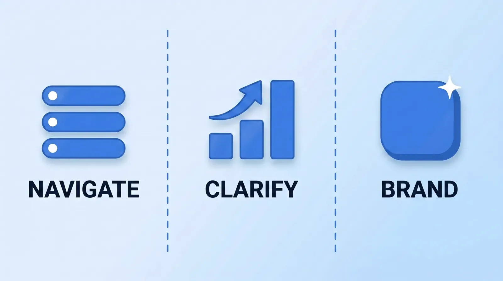
- Navigate — tell the viewer where they are and what's coming. Section cards, step counters, a progress indicator on a long tutorial. This is the same job video chapters do in the scrubber, done inside the frame for people who never touch the scrubber.
- Clarify — carry information that speech is genuinely bad at. Numbers in relation to each other, a spatial layout, a before/after, a process with branches. If you'd draw it on a whiteboard in a meeting, it's a clarify graphic.
- Brand — establish who made this, the job design and branding work is built to do. The intro sting, the lower third, the sign-off card. Deliberately repetitive, deliberately cheap to run, and covered in depth in our channel branding visual identity system post.
If a proposed graphic isn't doing one of those three, it's decoration. Decoration is not neutral — it costs build time, it costs render time, and it competes for the attention you were trying to hold.
The Redundancy Test
Here is the whole test, and it takes four seconds per graphic: mute the video and watch the graphic. Then close your eyes and listen to the same ten seconds. If you got the same information both times, delete the graphic.
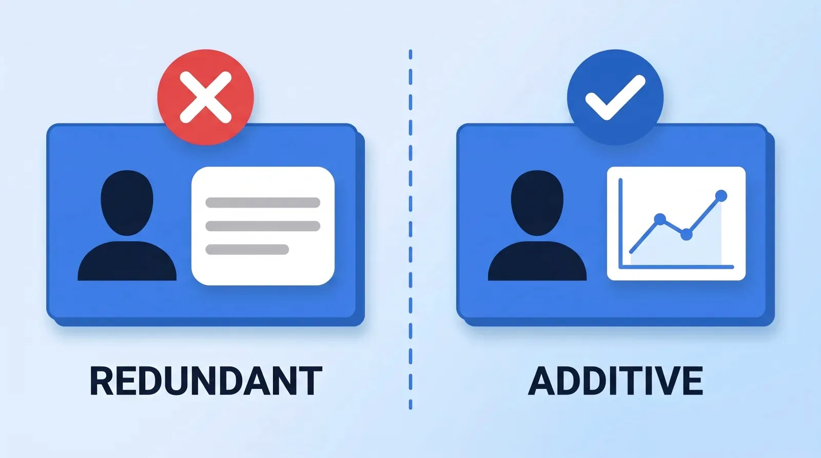
This is where most creator motion graphics die, and it's worth being precise about why. Redundant text on screen isn't just wasted — it actively splits attention between two encodings of one idea. The viewer reads faster than the speaker talks, finishes the sentence early, and spends the remaining three seconds with nothing to do.
There is one large, legitimate exception: captions are not motion graphics and are not subject to this test. They serve accessibility and sound-off viewing, and being redundant with the audio is the entire point. YouTube's subtitles and captions documentation treats them as a parallel track rather than a design element, and so do we — the only real decision there is burned-in vs closed captions.
The two failure modes we see most across client footage:
| What it looks like | Why it fails | What to do instead |
|---|---|---|
| Every key phrase gets a text pop | Redundant with audio; trains viewers to skim | Reserve text for numbers and proper nouns only |
| Whooshing transition between every section | Brand job done four times too often | One sting at the top, section cards after that |
| A full-screen stat card held for 6 seconds | Right idea, wrong duration — viewers read it in 1.5s | Cut to 2.5s, or add a second data point to justify the hold |
| Lower third for a solo creator's own channel | Nobody needs to be told whose channel this is at 4:12 | Lower third once, in the first 60 seconds, then never |
Duration Is a Design Decision, Not a Default
The most common note Mark Studios gets back on graphics isn't about the design. It's about how long it sits there. A rough rule that has survived thousands of edits:
- Short label (1–3 words): 1.5–2 seconds on screen
- Full sentence or a stat with context: 2.5–3.5 seconds
- A chart the viewer has to actually read: 4–6 seconds, and the speaker must stop talking over it
- Lower third: 3 seconds, animating in and out, never held
That third one is the one creators fight. Narrate over a chart at pace and the viewer can either read or listen, not both. Give the chart silence and a beat, or don't build the chart — it is an editing rhythm and pacing problem as much as a graphics one.
Build a Library, Not a Video
Here's the economics argument, and it's the reason our margins on graphics-heavy retainers work at all.
A bespoke animated element — designed from scratch, keyframed, rendered — runs 30 to 90 minutes of skilled labour. A creator putting eight bespoke elements in every weekly video is buying four to twelve hours of animation labour a week, forever, and getting a slightly different-looking lower third every time.
The alternative is a template library: a small set of parameterised elements built once, where producing the next instance means typing new text into a field.
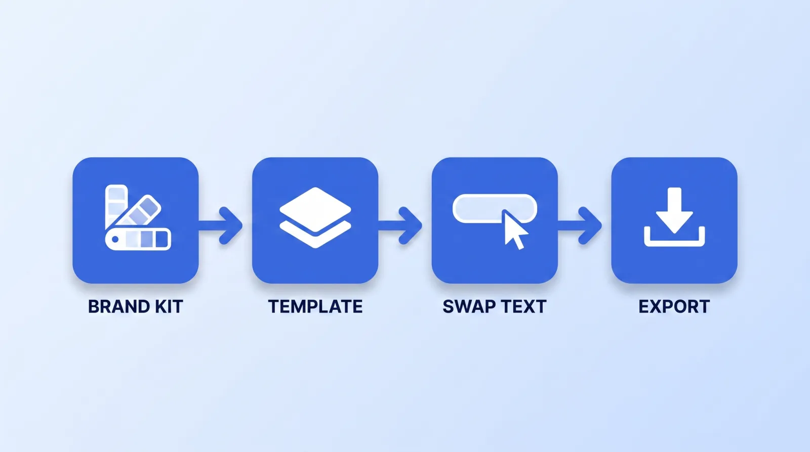
Every serious NLE supports this natively. Premiere Pro's Essential Graphics panel consumes Motion Graphics templates authored in After Effects; DaVinci Resolve does the same thing through Fusion compositions saved to the templates bin; Final Cut uses Motion-authored titles and generators. The tool is not the interesting part. The discipline of never building the same thing twice is.
The starter library we build for a new retainer client is deliberately small:
brand-assets/motion/
  01-intro-sting.mogrt          4s, locked, never edited
  02-lower-third.mogrt          name + role fields
  03-section-card.mogrt         one text field, 2s
  04-stat-callout.mogrt         big number + caption field
  05-quote-card.mogrt           quote + attribution fields
  06-list-builder.mogrt         up to 5 rows, staggered reveal
  07-comparison-split.mogrt     two labels, two values
  08-endcard.mogrt              subscribe + next video slot
  README.md                     fonts, hex codes, safe-area map
Eight files. That covers most of what a talking-head or explainer channel ever needs, and a competent editor can populate any of them in minutes. When a genuinely novel graphic is required — and once a quarter, one is — you build it bespoke, and then you decide whether it belongs in the library as file 09.
That README matters more than it looks. Hand an editor a folder of templates with no documented fonts, hex codes or safe areas and you get eight elements that each drift 4px differently. It needs font file paths, exact hex codes, safe-area margins, and the maximum character count each text field holds before it overflows.
The Legibility Gate
A graphic that's illegible on a phone is worse than no graphic, because it occupies attention and returns nothing. Before anything ships, Mark Studios runs this gate:
- Watch it at 30% window size on a phone. If the smallest text isn't readable, the type is too small. Roughly: nothing below 4% of frame height.
- Check contrast against the busiest frame it sits over, not the calmest. Graphics get approved over a blank wall and then break over a window at golden hour. Add a scrim, don't add a stroke.
- Keep it out of the UI zone. The bottom ~12% of frame is occupied by the player scrubber, the title bar, and end screens. Anything you put there is negotiable real estate.
- Render a test upload and look at compression. Fine gradients, thin strokes and small type are what YouTube's encoder punishes first — check your export against the recommended upload encoding settings before you build a whole library on 1px hairlines.
- Confirm no critical information is colour-only. A red bar and a green bar with no labels is a graphic that fails for a meaningful share of your audience, as covered in our video accessibility post.
- Watch the whole video once at 2x with the graphics on. If the video feels busy at 2x, it is busy at 1x — you just stopped noticing.
That gate takes ten minutes and it is the highest-yield ten minutes in the whole graphics workflow.
What the Data Actually Supports
Be honest about what's knowable here. There is no public dataset that says "adding a lower third at 0:45 raises retention by 3%." Wistia's video marketing statistics report finds that for educational and tutorial videos under five minutes, "people watch about halfway through" — the drop-off is structural, not decorative, and no amount of animation fixes a video that hasn't earned the next thirty seconds. The big numbers that do circulate don't hold up: the claim that motion graphics "boost shares by 1,200%" began as a count of video posts on Facebook brand pages and was never about motion graphics (motion graphics statistics). Backlinko's analysis of YouTube ranking factors points the same direction: the signals that move are watch time and engagement, not production polish.
Which is the uncomfortable conclusion. Across the 10,000+ videos Mark Studios has delivered — work that sits behind 100M+ views — we have never once seen graphics rescue a weak structure. We have repeatedly seen them clarify a strong one, and we have repeatedly seen them clutter a strong one into mediocrity. Graphics are an amplifier with a sign attached, and the sign is set by whether each element passed the redundancy test.
The Bottom Line
A motion graphic earns its place only if it navigates, clarifies, or brands — and only if muting the video would cost the viewer information. Build eight parameterised templates instead of eighty bespoke animations, document the fonts and safe areas alongside them, and run the legibility gate on a phone before anything ships. The goal was never more graphics. It was fewer graphics that each do a job.


