

Captions Cover One Sense. Video Uses Two.
The World Health Organization estimates that at least 2.2 billion people live with a near or distance vision impairment. Every one of them can hear your video perfectly. What they cannot do is read the text you put on screen, follow the thing you silently pointed at, or understand the chart you cut to without saying a word about it.
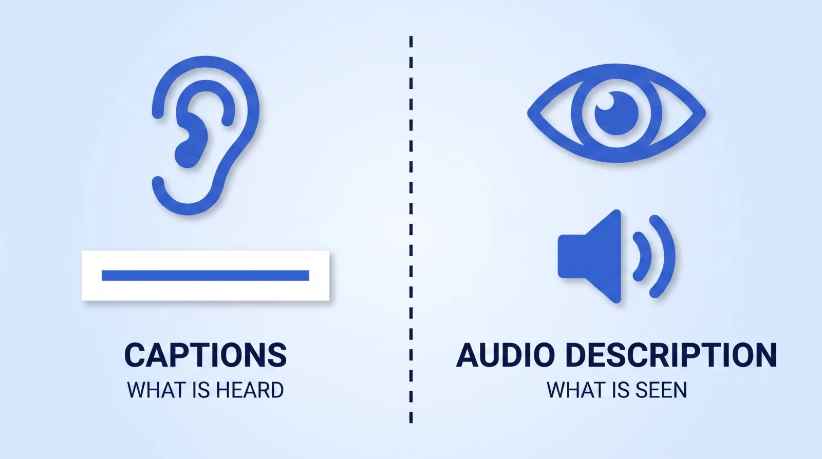
That is the gap captions do not touch. Captions carry what was heard to someone who cannot hear it. There is a second track, going the other direction, that carries what was seen to someone who cannot see it — and almost nobody in the creator economy ships it.
We have edited 10,000+ projects driving 100M+ views, and I can count on one hand the briefs that asked for anything past a caption file. It is not indifference — most creators do not know the other four layers exist, because captions is where the conversation stops.
1. Audio Description Is the Track Nobody Ships
Audio description is a narration track that speaks the essential visual information out loud during the natural pauses in your existing audio. The W3C calls it description of visual information, and it is not optional under the standard: a descriptive transcript or description track is required at Level A, and audio description is required for all prerecorded video in synchronized media at Level AA.
YouTube now supports it natively. Creators with multi-language audio access can upload a descriptive audio track in YouTube Studio alongside the original — same Languages panel used for dubs, different purpose. If you already run multi-language dubbing, the delivery pipeline is one you have built.
Two practical notes from doing this on client work:
- Standard description fits in the gaps. Extended description does not. If your edit is wall-to-wall talking with no air, there is nowhere to put the narration, and the W3C's answer is extended description — pausing the video to make room. That is a structural edit decision, so it belongs in the script stage, not the delivery stage.
- A talking-head video usually needs none of it. The W3C is explicit that if the video is only a person speaking, description is unnecessary. Description exists for the demo, the screen recording, the chart — the moments where your picture carries information your audio never states.
The cheapest fix costs nothing: write scripts that say what is on screen. "As you can see here" fails two audiences at once. "This bar — the third one — is the one that doubled" works for everybody, and it survives being consumed audio-only, which is how a growing share of long-form gets watched anyway.
2. The Legibility Rules Your Lower Thirds Break
On-screen text is where accessibility and plain retention overlap completely. WCAG's Contrast (Minimum) criterion asks for a 4.5:1 luminance ratio between text and its background — 3:1 if the type is large. Most creator lower thirds do not clear it, because they were designed as white text with a soft shadow over footage that changes brightness every four seconds.
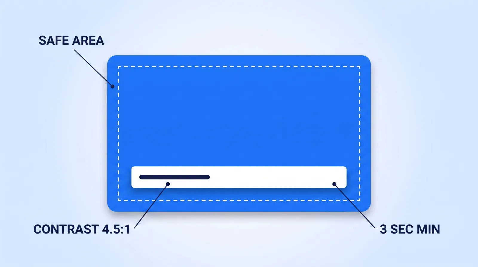
This is the spec Mark Studios works to:
| Property | Spec | Why |
|---|---|---|
| Contrast ratio | 4.5:1 minimum against what is behind it | Shadows are not contrast; a plate or scrim is |
| Minimum type size | 4% of frame height | ~43px at 1080p; survives a phone at arm's length |
| Safe area | 5% inset from every edge | Player chrome and platform UI eat the margins |
| Time on screen | 3 seconds minimum, or 1.5× read-aloud time | Faster than that and half the audience misses it |
| Motion in | Under 0.5s, no strobing entrance | Animated text you cannot read is not text |
The safe-area rule is the one that bites hardest on repurposed content. A lower third placed perfectly in a 16:9 master lands under the caption block, the like button, or the username the moment it is cropped to 9:16. If a vertical cut is in the plan, position for the vertical frame first.
3. Color Is Never the Only Signal
Roughly 8% of men have some form of color vision deficiency, overwhelmingly red-green. Which means the single most common convention in explainer graphics — red bar bad, green bar good — is the single most common accessibility failure in explainer graphics.
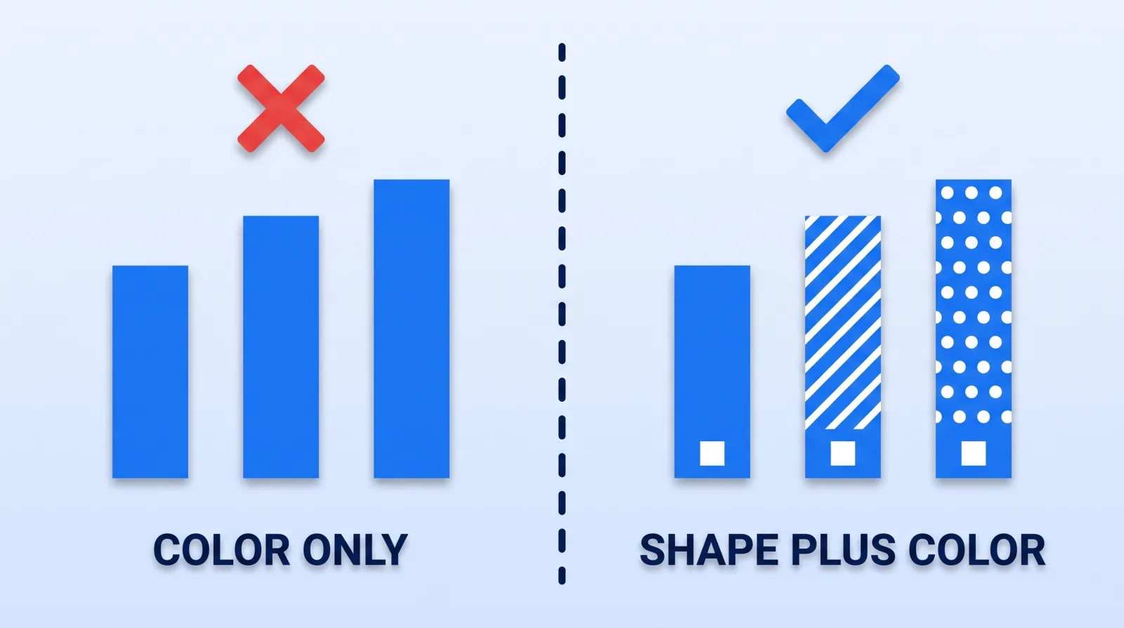
The rule is simple and it costs an editor about ninety seconds: anything encoded in color must also be encoded in shape, position, pattern, or a label. Different fills on the bars. An arrow direction, not just a hue. The word "down," not just the color of the number.
Same logic applies to grading. A heavily teal-and-orange look can flatten skin tones and UI screenshots into near-identical luminance, which is a legibility problem before it is an aesthetic one. Our color grading workflow ends with a luminance-only check for exactly this reason — kill the saturation, and if the shot stops reading, the grade is doing work the composition should be doing.
4. Flash Safety Is the One That Carries Real Risk
WCAG 2.3.1 says content must not flash more than three times in any one-second period unless it stays below the general and red flash thresholds. Saturated red gets its own tighter test, because people are more sensitive to it than to other colors.
Every editor should know where this shows up in normal work, because none of it looks like a strobe when you are scrubbing at 4× speed:
- Hard-cut montages of high-contrast frames at four or more cuts per second
- Camera-flash SFX stacked on a title reveal
- Glitch and RGB-split transitions with the intensity pushed
- Flashing "SUBSCRIBE" bugs and looping red alert overlays
- Concert, arcade, and stock footage that came with strobing baked in
The fix is not to remove the energy — it is to keep the cut rate under the threshold, drop the flash opacity so the luminance swing stays small, or add a short blur between frames. All three preserve the pacing and remove the risk.
5. What the 2026 Rules Actually Require of You
If you only make videos for your own channel, none of this is legally binding. If you produce video for a client that is a U.S. state or local government entity — a university, a city, a school district, a transit authority, a public health department — it is.
The Department of Justice's Title II web and mobile app accessibility rule adopts WCAG 2.1 Level AA as the technical standard (see where caption rules stand), which pulls in captions, audio description, contrast, and flash thresholds together. The compliance clock moved this year: an interim final rule published April 20, 2026 pushed the deadline for entities serving populations of 50,000 or more to April 26, 2027, and everyone smaller to April 26, 2028. The DOJ's first-steps guidance is the plain-language version.
Read that as a commercial signal, not a legal one. Every public-sector video budget in the U.S. now carries an accessibility line item, and the shops that already offer content localization and accessibility production — description tracks, captions and a conformance note included — are the ones asked to quote. We put accessibility deliverables in the brief template by default for exactly that reason.
The 8-Point Accessibility Gate
Run this before publish. It takes under ten minutes on a finished cut:
- Caption file uploaded and timed, not auto-generated and left alone.
- Every on-screen text element clears 4.5:1 against what sits behind it.
- All text is at least 4% of frame height and inside a 5% safe-area inset.
- No text card is on screen for under three seconds.
- Nothing in the timeline flashes more than three times in any one second.
- Every color-coded element also carries a shape, pattern, position, or label.
- The script names what is on screen, or a description track exists.
- The video is watched once at 50% volume on a phone at arm's length — the real viewing condition.
Point 8 catches more than the other seven combined.
The Bottom Line
Captions solve for the viewer who cannot hear you. Almost nothing in the standard creator workflow solves for the viewer who cannot see you, cannot separate your red bar from your green one, or cannot safely watch your glitch transition. Those are four separate audiences, and three of them are currently being served by nobody.
Every fix on this list — contrast, size, dwell time, redundant encoding, flash rate — also raises comprehension for the fully-sighted viewer watching on a cracked phone in daylight. You are not adding an accessibility layer. You are removing reasons people stop watching.


