

A Vertical Crop Throws Away Two Thirds of Your Frame
Do the arithmetic before you do anything else. A 9:16 crop taken at full height out of a 1920×1080 frame is 608 pixels wide. That is 31.6% of the width you shot. Everything else — the second person in the two-shot, the product on the right of the desk, the graphic you carefully placed in the lower third — is outside the crop and gone.
Nobody plans for this. They shoot a normal 16:9 interview, deliver it, and three weeks later someone asks for ten verticals. At that point the vertical framing is not a creative decision, it is damage control. Across 10,000+ projects at Mark Studios — work sitting behind 100M+ views — the single cheapest change a channel can make to its short-form video editing output is not a better editor. It is deciding where the vertical crop lives before the camera rolls.
This post is about that decision. It is upstream of our long-form to shorts repurposing system, which assumes you already have footage and salvages what you can. Here we are trying to make sure there is nothing to salvage, because the vertical was framed on the day.
The Center Column
The whole technique reduces to one habit: treat the middle third of your 16:9 frame as a second, permanently live frame.
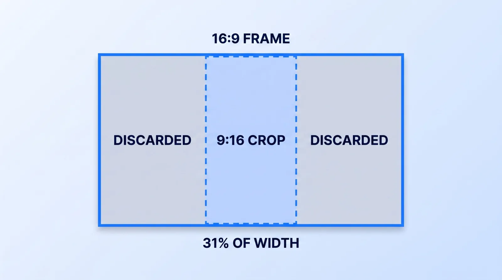
Anything the vertical version needs — the speaker's face, the product, the hands, the reaction — has to be inside that column. Anything the horizontal version needs but the vertical does not can live in the outer thirds: the negative space that makes a wide establishing shot — often a drone plate — breathe, a second subject in a cutaway, set dressing, a light stand you're deliberately not hiding.
That constraint sounds punishing and it mostly isn't, because the horizontal frame does not actually want its subject at the edge. What it changes is your blocking discipline:
- Single presenter: center them, or off-center by no more than a sixth of the frame width. Rule-of-thirds placement at the extreme left or right third puts them at the very edge of the vertical crop or outside it.
- Two-shot: you cannot keep both people in one vertical crop from a wide 16:9. Shoot the two-shot as your wide, then get a centered single of each person for the vertical cut. This is the one place multi-aspect delivery genuinely costs you setup time.
- Product or demo: the object goes in the column, the hands enter from the sides. Do not let the action drift to where the light is nicest if the light is at the edge.
- On-screen graphics: build them for the column, not the frame. A lower third that spans 80% of a 16:9 frame is a lower third that reads as three cut-off words in vertical.
Give Yourself a Resolution Budget
The second half of the problem is pixels. A vertical crop is a crop, and if you shot 1080p there are not enough pixels left to fill a 1080×1920 delivery without upscaling.
| Source format | Full-height 9:16 crop | Fills 1080×1920? |
|---|---|---|
| 1080p (1920×1080) | 608×1080 | No — 78% upscale, visibly soft |
| 2.7K (2704×1520) | 855×1520 | No — 26% upscale, borderline |
| 4K UHD (3840×2160) | 1215×2160 | Yes, 12% to spare |
| 6K (6144×3456) | 1944×3456 | Yes, with room to reframe or punch in |
This is the actual argument for shooting 4K on a channel that publishes 1080p: not sharpness on the long-form upload, but headroom for the vertical crop and for a punch-in that still holds. YouTube's recommended upload encoding settings are indifferent to how you got there, and Shorts will happily accept a soft upscale — the platform will not stop you, the audience just quietly reads it as lower production value. If you are still choosing bodies and lenses, our creator gear buying guide treats sensor readout and recording format as the same decision as this one.
One caution that costs people real money: shooting 4K to crop is not free downstream. Storage, proxy generation and export times all scale, and the export settings that keep your upload sharp matter more, not less, once a clip has been cropped and rescaled.
The UI Eats Your Frame
A vertical video is not delivered into a clean rectangle. Both TikTok and Shorts overlay the frame with captions, usernames, action rails and a title block, and none of that is under your control. TikTok's own guidance on creating videos and every current social video spec roundup describe the same broad geography, and the safe area shifts with every app update.
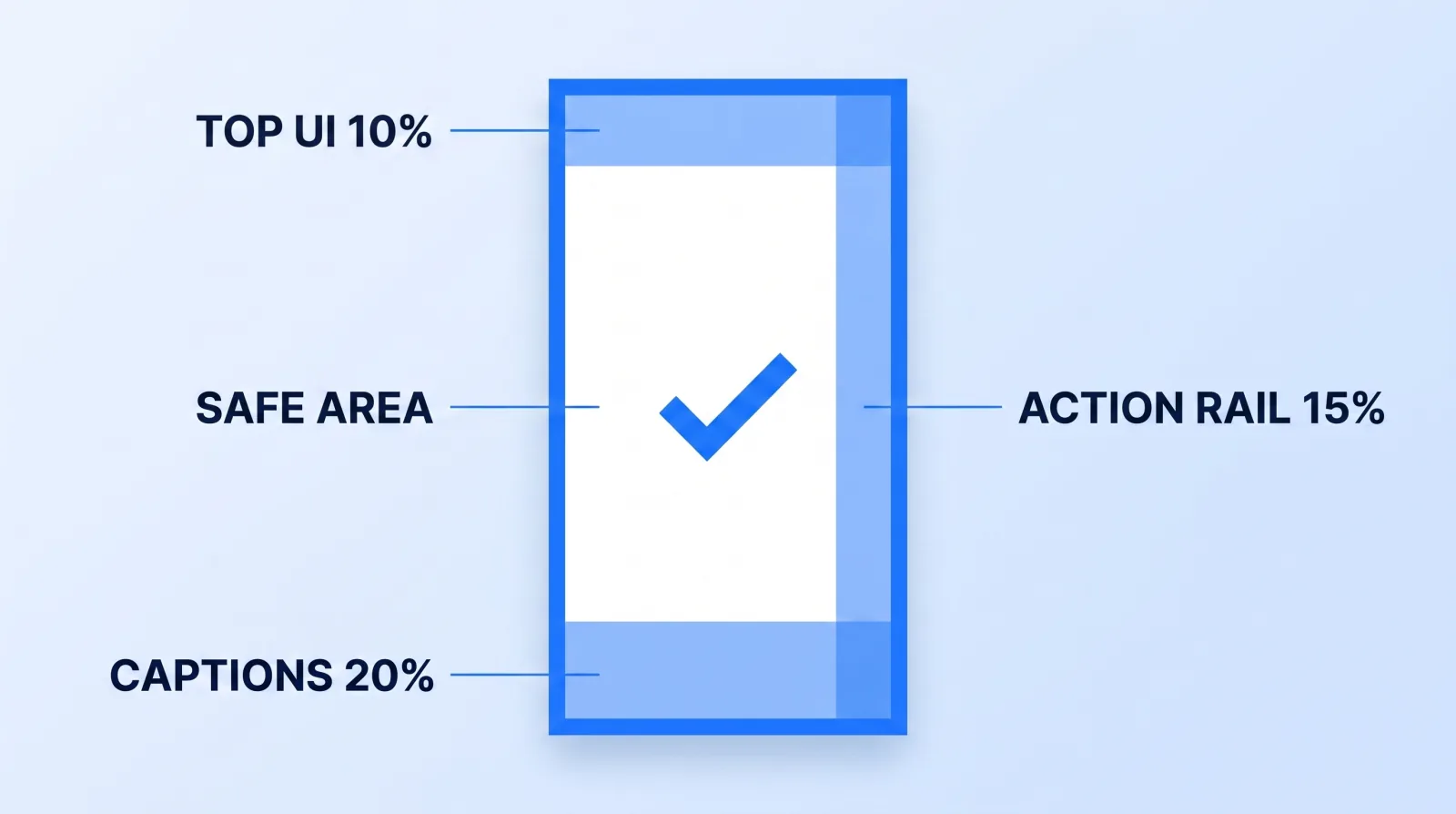
So we don't chase the current pixel values. We use one conservative house safe area across every platform, deliberately tighter than any single app requires:
| Region | Margin we keep clear | What the platform puts there |
|---|---|---|
| Top | 10% of frame height | Status bar, "Following / For You" tabs |
| Bottom | 20% of frame height | Caption, handle, sound credit, title block |
| Right edge | 15% of frame width | Like / comment / share / profile rail |
| Left edge | 5% of frame width | Nothing usually — margin for text ragging |
That leaves a working area of roughly 80% of the width and 70% of the height. Faces, product, and any burned-in text go inside it. If you are burning captions in, they sit above the bottom 20% band, not in it — the reasoning behind that choice is in our post on burned-in vs closed captions.
The Pre-Flight Framing Gate
Run this before the camera rolls, not after. It takes about five minutes.
- Decide the vertical deliverables first. How many verticals, from which segments? A shoot that owes six Shorts blocks differently than one that owes none.
- Set the record format for the crop, not the delivery. If verticals are owed, shoot 4K or wider. If none are owed, 1080p is fine and cheaper everywhere downstream.
- Turn on a 9:16 guide overlay in-camera. Most current mirrorless bodies and every field monitor can display a vertical aspect guide. If yours can't, mark the monitor with tape — it works and it costs nothing.
- Block every subject inside the guide. Walk the frame with the talent, not from behind the camera. Watch where they drift when they get animated, and give them a floor mark.
- Keep the outer thirds honest. Nothing essential out there, and nothing embarrassing either — the wide is still a real deliverable, not a container for the vertical.
- Shoot a five-second centered single of anything that appears in a two-shot. This is the insurance clip. It costs nothing on the day and saves the vertical cut every time.
- Check one test crop on set. Pull one still, crop it 9:16 in the camera or on a phone, look at it. Every framing problem this post describes is visible in that one still.
Auto-Reframe Is a Finisher, Not a Plan
Premiere Pro's Auto Reframe and the equivalent smart-reframe tooling in DaVinci Resolve both do the same thing: track the salient subject and animate the crop window to follow it. On a single centered presenter they are genuinely good, and Mark Studios uses them as a first pass to save keyframing time.
They fail predictably in three places, and knowing which three is the whole skill:
- Two subjects. The tracker oscillates between faces, producing a pan the viewer reads as a camera mistake. Cut to a single instead.
- Fast lateral movement. The crop lags the subject, then snaps to catch up. Hand-keyframe those seconds.
- Text and graphics in frame. The tracker follows the person and slices the graphic. Rebuild the graphic in the vertical sequence rather than letting it be cropped.
Auto-reframe applied to badly blocked footage produces a wandering, unstable vertical — which is the same category of problem covered in what editors can actually fix in post. The tool moves a window. It cannot invent the pixels that were never in the column.
What This Actually Changes About Your Cost
Here is the part that matters commercially. When a client sends us a 16:9 master and asks for verticals, the vertical work is a reconstruction: hand-keyframed crops, rebuilt graphics, and roughly 30–45 minutes of editor time per short before anyone has thought about the hook or the pacing. When the same client shoots against a 9:16 guide, the vertical crop is a static frame with no keyframes, the graphics were built for the column, and the same short lands in 10–15 minutes.
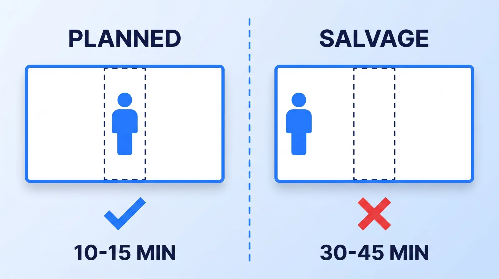
Multiply that across a channel publishing four verticals a week. Nothing about the camera changed, nothing about the talent changed, and the tape on the monitor cost nothing — the only difference is that the framing decision was made once, on the day, by the person who could still do something about it. Wistia's video marketing research is blunt about how little runway a short clip has to hold a viewer; you do not want to spend that runway on a subject sliding around inside a crop.
If short-form is a serious channel for you rather than an afterthought, this pairs directly with the platform-by-platform decisions in our cross-platform playbook for TikTok, Reels and Shorts. If you'd rather hand off the verticals, our Instagram Reels editing service cuts them from the same master.
The Bottom Line
A 9:16 crop keeps under a third of your 16:9 width, so the vertical is framed at the camera or it is salvaged in the edit — there is no third option. Block every essential subject inside the center column, shoot enough resolution that the crop doesn't need upscaling, keep the top 10% and bottom 20% clear for platform UI, and grab a centered single of anyone who appears in a two-shot. Five minutes of guide setup replaces half an hour of reconstruction per short, every week, forever.


