

YouTube Counts the Subscribers Your Channel Page Earned. Almost Nobody Opens the Report.
Open YouTube Studio, go to Analytics, click SEE MORE on any card, and switch the dimension to Subscription source. YouTube's own documentation says the report exists to help you "understand what content or YouTube pages are best at converting viewers to subscribers" — and one of the sources it breaks out is your channel itself, separate from every video sitting on it.
That number is on almost every channel with enough traffic to populate the dimension, and in the 12-point channel audits we run before taking a client on, it is the most reliably unopened report in Studio. The reason is structural: every video gets a custom thumbnail, a written title, and an argument about both. The channel page gets built once, in the week the channel was created, and then nothing.
Across 10,000+ projects at Mark Studios — work behind 100M+ views — the pattern barely varies. The trailer is three years old and opens with "hey guys." The description is one sentence. The banner has text sitting where a phone crops it off. Meanwhile the page is what a brand opens before replying to a pitch, what a podcast guest opens before saying yes, and what a viewer opens after one good video to decide whether there is a second.
The Page Shows Two Different Videos to Two Different People
Most creators know there is a trailer slot. Fewer know there are two, and that YouTube picks between them based on whether the visitor has already subscribed.
From YouTube's channel layout documentation: "Your channel trailer offers a preview of your channel so viewers can learn more and subscribe." The second slot is described separately — "You can highlight your video or any video on YouTube for returning subscribers to watch when they go to your channel Home tab."
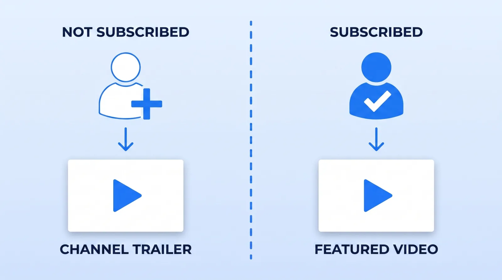
Both carry the same constraint, and YouTube states it twice on that page: "Once a viewer watches your channel trailer, it won't be shown to them again," with the identical rule for the featured video. That single sentence is the one most channels are built against. The trailer is not a permanent storefront — it is one impression per new viewer, after which that person's home tab moves on to whatever sits below it.
What Actually Belongs in Those Two Slots
If the trailer plays once, it has to do one job: tell a stranger what the channel makes, who it is for, and how often it arrives. A dedicated trailer only earns the slot if it does that job better than your best real video does. On most channels, it doesn't.
| Slot | Who sees it | What is usually there | What we put there |
|---|---|---|---|
| Channel trailer | Visitors who have not subscribed | A two-minute "welcome to my channel" recorded three years ago | The strongest video of the last 90 days, or a purpose-cut 45–60 seconds that names topic, format and cadence |
| Featured video | Returning subscribers | Nothing, or the same stale trailer | The newest upload you want watched, or the one the algorithm under-served |
The featured slot is the more valuable of the two and the more neglected. It is aimed at people who already opted in, which makes it the only free distribution you control outright — no thumbnail auction, no impressions lottery. When a client's upload underperforms in its first 48 hours and the retention graph says the video is fine, promoting it into the featured slot is the cheapest correction available.
One rule for a purpose-cut trailer edit: no cold open, no channel-intro animation, no "before we get started." A viewer who is already on your channel page has clicked. Spending their first eight seconds on a logo sting is spending the only impression you get.
The Header Is Doing More Work Than the Trailer
The banner is the first thing rendered and the asset most often built at the wrong dimensions. YouTube's channel branding documentation gives three numbers that matter: a minimum upload of 2048 x 1152 px at 16:9, a safe area for text and logos of 1235 x 338 px, and a file size of 6 MB or smaller. The separate banner and profile picture tips page pushes higher, recommending "at least 2560x1440 px to achieve the best display on all devices," and suggests putting your upload schedule on the banner if you keep one.
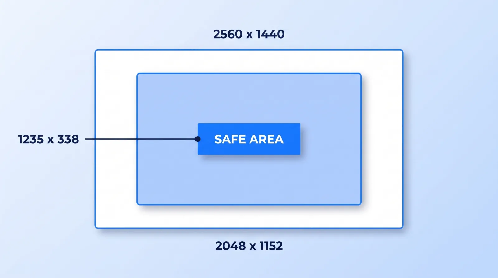
That 1235 x 338 band is the entire design brief. Everything outside it is decoration that a TV crops wider and a phone crops tighter — which is why so many banners read perfectly on the monitor they were designed on and show a headless logo everywhere else. If you are building a full visual identity system, the banner is the one asset where the safe area, not the canvas, is the real dimension.
The rest of the header is a set of fields nobody revisits. YouTube confirms "Your description is accessible in the channel header," so the first two lines are read before anyone clicks more — write them as a plain sentence stating who the channel is for, not a bio. You "can showcase up to 14 links on your channel Home tab," and YouTube notes the first one is displayed prominently near the subscribe button while the rest hide behind a click, which makes link order a decision worth 30 seconds. Business enquiries have a dedicated contact field, so they do not belong in the description. And if any measurable share of your audience is non-English, YouTube supports translations of the channel name and description — a field almost nobody fills.
Twelve Sections Is a Budget, Not a Storage Limit
Below the fold, "You can customize the layout of your channel Home tab with up to 12 custom sections," and YouTube also offers a "For you" section that "gives your audience a tailored experience when visiting your channel Home tab."
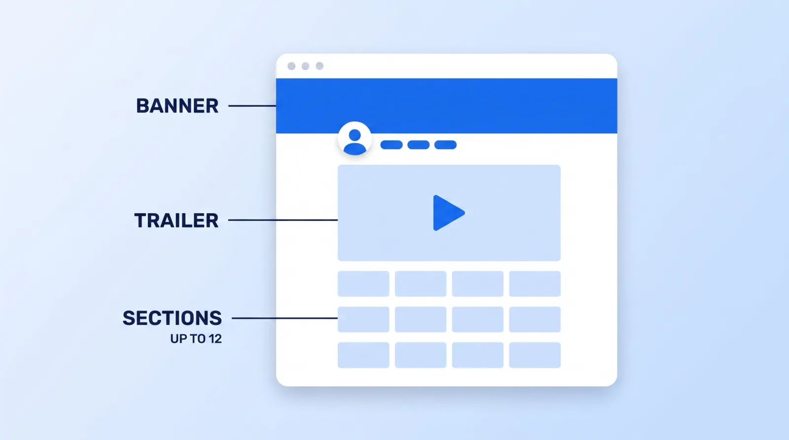
Channels fail this in one of two directions. They use two sections — Uploads and Popular — which tells a visitor nothing about how the catalog is organised. Or they use all twelve, filled with playlists named after upload batches, which is a filing cabinet with the drawers open.
Four to six sections, ordered by what a new visitor needs, beats both. Lead with the series you most want associated with the channel, follow with the playlist that holds attention longest, and only then show Uploads. Sections are also the last place playlists get surfaced deliberately, which makes them part of the same machinery as playlists, end screens and cards — the difference is that sections work on people who arrived without watching anything yet.
The 20-Minute Channel Page Pass
Run this quarterly, or the week after any channel pivot:
- ✅ Open Subscription source in Analytics and record what your channel page converted over the last 90 days
- ✅ View your own channel signed out, in a private window, on a phone — that is the version strangers get
- ✅ Confirm all banner text and logos sit inside 1235 x 338, with the file uploaded at 2560 x 1440
- ✅ Replace the trailer if it is older than the current format, or point the slot at your best recent video
- ✅ Set a featured video for returning subscribers — it is almost always empty
- ✅ Rewrite the first two lines of the description to say who the channel is for
- ✅ Reorder your links so the one you actually want clicked is first
- ✅ Cut sections down to four to six, ordered by what a new visitor needs first
- ✅ Re-check Subscription source 90 days later and see whether any of it moved
Item 9 is the whole point. Every other item is a guess until the report tells you whether the page converts better than it did.
The Bottom Line
Your channel page is the only asset on YouTube that a brand, a collaborator, and an undecided viewer all open before they say yes. Most creators optimise the surfaces that bring people there and leave the surface people land on exactly as it was on day one.
Twenty minutes fixes almost all of it: a trailer that plays once and says what the channel is, a featured video for the people who already subscribed, text inside the safe area, and a section list short enough to read. Then check Subscription source in 90 days — it is the only feedback loop on this page, and it is already running.


