YouTube Asks for 4K. The Feed Shows You About 210 Pixels.
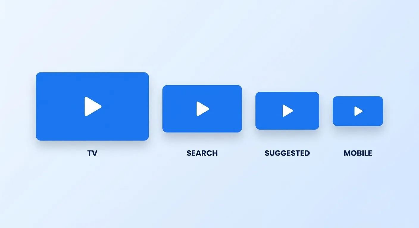
YouTube's custom thumbnail guidance now recommends uploading at 3840 × 2160 — the image "should be as large as possible," because it doubles as the preview in the embedded player. Almost nobody sees it at that size. In the suggested rail beside a playing video the same file renders around 210 pixels wide. That is roughly an eighteenfold reduction between the file you approve and the image that actually earns the click.
That gap is where most thumbnails fail, and it is not a taste problem. It is a process problem: nobody checked the file at the size the decision actually gets made. Across 10,000+ delivered projects — work sitting behind 200M+ views and over $10M in client revenue — the single cheapest quality gain we have found is not better thumbnail design, it is a fixed review gate run before anything publishes.
This is that gate. Our guide to thumbnail CTR psychology covers how to design one; this post covers how to decide whether the one in front of you is allowed to ship.
Three Gates, In Order
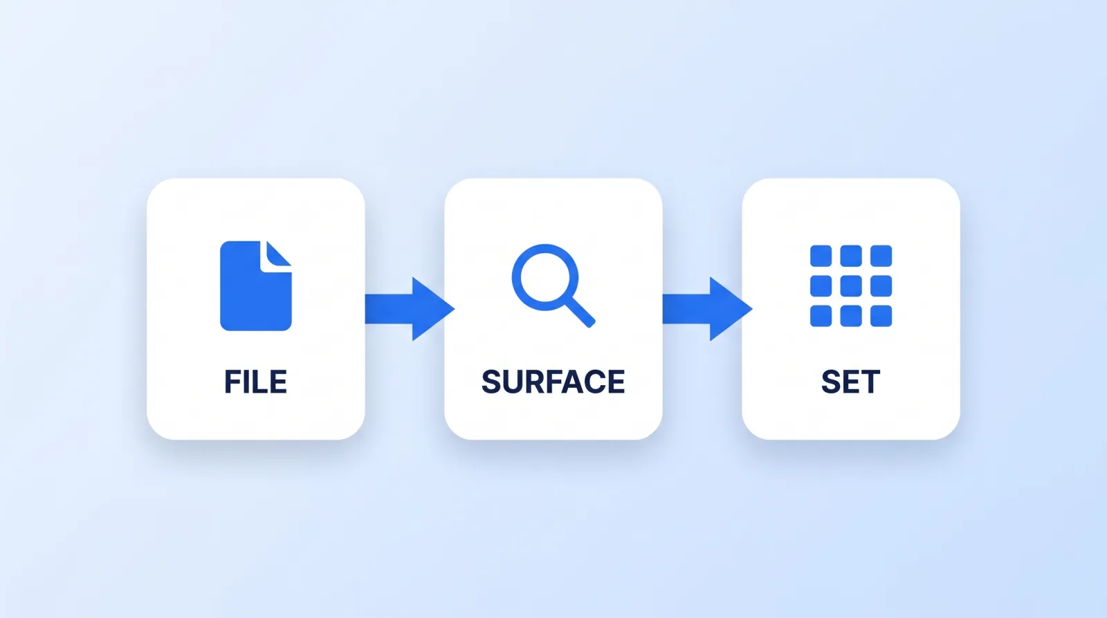
Run them in sequence. Each gate is cheap and catches a different class of failure, and a thumbnail that fails gate one is not worth arguing about on gate three.
Gate 1 — The file
Mechanical, objective, no judgement required. Anyone on the team can run it.
- Export at 3840 × 2160, JPG or PNG. The stated minimum is only 640 pixels wide, but small uploads get upscaled on the surfaces that matter. File limits are generous from desktop — 50 MB for video, Shorts and podcast thumbnails — and much tighter from mobile, at 2 MB for video and 10 MB for podcasts. Export once, upload from desktop.
- Match the aspect to the format. 16:9 for videos, 9:16 for Shorts, 1:1 for podcast playlists. The trap: a vertical video with a 16:9 thumbnail gets replaced by an auto-generated 4:5 crop on home, explore and subscriptions. Your custom image survives only on the watch feed, watch history and non-mobile platforms — so on a vertical upload you are designing a thumbnail most of the feed will never show.
- Nothing important in the bottom-right corner. The duration stamp sits there on every surface and will cover whatever is underneath it.
- Nothing important in the outer 5%. Different surfaces crop marginally differently, and rounded corners eat the edges.
- Check the exported JPG, not the layered file. Compression is where thin strokes, small text and subtle gradients fall apart — judge the artifact you are actually uploading.
Gate 2 — The surface
This is the gate almost everyone skips, and it is the one that matters most.
Shrink the image to roughly 210 pixels wide and look at it again. That is approximately the width of a suggested-video thumbnail on a desktop browser, and it is the harshest common case. Then ask three questions:
- Can you tell what the video is in under a second? Not read it — recognise it. If your eye has to hunt, the feed has already scrolled.
- Is the text still legible, or is it just texture? Four words is a practical ceiling at small sizes. YouTube's own thumbnail and title guidance makes the same point: the thumbnail and title work as a pair, so the thumbnail does not need to carry the whole sentence.
- Does it fight the title or finish it? A thumbnail that repeats the title wastes half the surface. The strongest pairs put a claim in one and the evidence in the other.
Gate 3 — The set
A thumbnail is never seen alone. It appears in a grid beside your other videos, on your channel page, and in a subscriptions feed next to whoever else published today.
- Put it beside your last eleven. Open your channel's video grid. If the new one disappears into the pattern, it will disappear in the feed too. If it clashes so hard it looks like a different channel, that is also a failure.
- Check it against the competitor set. Search the query you are targeting and look at the actual results page. You are not designing against a blank canvas, you are designing against the nine thumbnails that will sit around yours. Backlinko's ranking-factor research is a reasonable primer on which of those surfaces you are competing in.
- Confirm the channel page still reads. Your channel page is a landing page, and a run of near-identical thumbnails turns it into wallpaper.
When It Fails, Change One Thing
The common mistake after a failed gate is a full redesign. Usually one variable is doing the damage:
| Symptom at small size | The usual cause | The single change |
|---|---|---|
| Reads as a grey smudge | Subject and background have similar luminance | Raise subject/background contrast, not saturation |
| Text unreadable | Too many words, or too-thin weight | Cut to three or four words, heavier weight |
| Looks like every other upload | Same crop and palette every time | Vary the composition, hold the palette |
| Fine at full size, mush when compressed | Thin strokes and soft gradients | Thicken strokes, flatten gradients |
| Nobody can tell what it is | Two competing focal points | Delete one |
Let the Data Settle It
Judgement gets you to a defensible thumbnail; it does not tell you which of two defensible thumbnails wins. YouTube's A/B test for titles and thumbnails runs up to three variants concurrently against real traffic and takes a few days to two weeks to resolve. It is available on public long-form videos and podcast episodes once advanced features are enabled, and it will not run on videos set as made for kids or for mature audiences.
Two rules make the results worth having. Test variants that differ on one dimension — swap the subject or the text, not both, or the result tells you nothing you can reuse. And test on videos with enough traffic to resolve; on a small channel the test will spend two weeks failing to reach significance while the video ages out of its window.
Run this gate consistently and the compounding is in the set, not any single upload. A channel whose thumbnails are individually fine and collectively indistinguishable performs worse than one with a legible visual system — which is the argument for treating thumbnails as part of your channel branding system rather than as a per-video afterthought.
If you would rather not run this gate yourself every week, it is the kind of repeatable work we take on — our thumbnail design service exists because most channels need the consistency more than they need any one hero image. It is also disproportionately valuable in categories where the thumbnail is the pitch, which is why we break it out separately for gaming creators.
The Bottom Line
Most weak thumbnails were never bad designs — they were good designs nobody checked at the size that decides anything. Shrink it to 210 pixels, put it beside your last eleven, and let a concurrent A/B test settle the close calls. The gate takes about five minutes and it is the cheapest quality control in the entire upload pipeline.